This is random question that came when I was doing typing on the keyboard and I wanted to make sure if the layers and key buttons corresponded, were correct, turns out I finish up by researching about sign punctuations and rules that are related to their grammar, as well of course their typography…let’s see if you can discern by their shape and what are they use for. (I hope I’m not the only one who doesn’t get along with their marks )
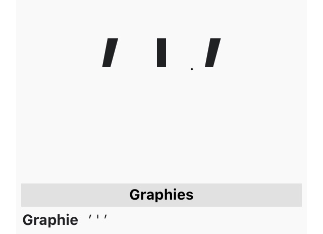
And btw, it’s get king of confusing, (at least for me), kind of look alike but I’m not sure if it’s the typography. (This is the same sign mark in all three)
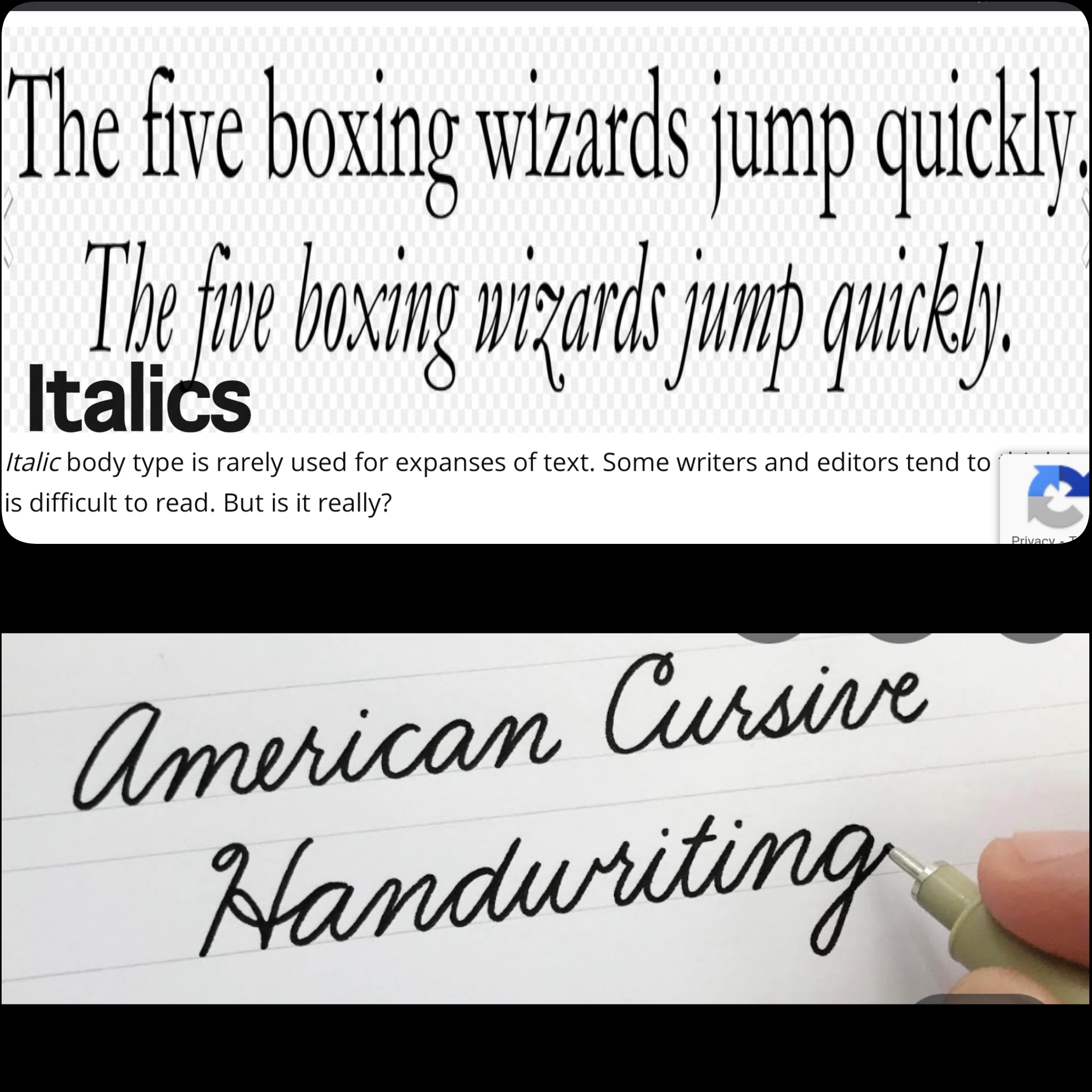
And know that I think it better I don’t quite understand the full difference between “italic” and “cursive” per se…do you?
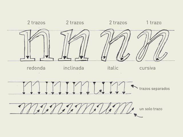
The first, in the top picture, looks like an apostrophe, the others could be apostrophes or accent marks. They do seem quite similar in the bottom picture. As for the difference between italic and cursive, for me, it’s that italic is when the letters all slant to the left, cursive is when the letters in each word are joined together. So you can have italicized cursive letters, but they can be each used alone. I’m adding a quick illustration to show the difference I think of between cursive and italics.
But notice the italic is a bit rounder(sans serif) and has a left leaning slant, the strokes are still separated like the original and leaning like the inclined one. Once you get to the cursive the letter is formed in a single stroke. And I will admit usually has a left leaning slant.
Right, further in to my research I found that the focus should be in 2 factors:
-The body (where it starts)
-The inclination (This is specifically in the “prima” (don’t know it if translated correctly) (used in Math) and the orthographic accent (acute) that you find in languages like Spanish and French, which contrasts more with the “grave accent”, so there’s his “opposition”, but I also hear it by the name of “inverted quotation marks” (which their shape is the same?), and the apostrophe turns out to be the same as the quotation mark that closes a clause, which in his constitution is the same as a comma but elevated…
But I don’t know if it’s just me…but I can see a tiny different in the size of the sign…don’t know, let’s see what others think…
Now I think I can start sleeping back again in peace…
Btw, @PinAngel I mention these, because in text processors like word they are called “Cursive” but to me it seems more just that a regular Italic, if you see the command shortcut “Ctrl+I” that’s an abbreviation of “Italic”, so why it is refer to Cursive?, and as general rule of thumb cursive or italic (at this point, I can’t believe in anything ), are used to highlight words that are used in an extra-linguistics context, aka this word just can’t be read as you would do it with the other “normal” words, because carries some nuances. I will keep digging into it
 )
)


 ), are used to highlight words that are used in an extra-linguistics context, aka this word just can’t be read as you would do it with the other “normal” words, because carries some nuances. I will keep digging into it